Successful B2B Marketers Start Here
Join the #1 B2B Publisher Network
Monetize your
RevResponse enables digital Publishers to effectively monetize all forms of B2B traffic via programmatic ad technologies, native advertising, and the largest inventory of professional content.
Join for Free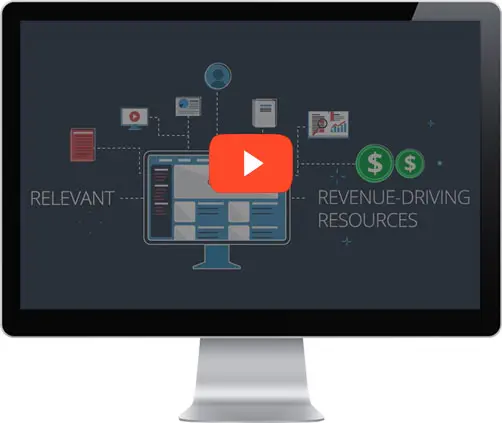
Watch How RevResponse Works
"...consistently provide high-value curated content that truly benefits your readers, increasing loyalty, engagement, and earnings."Watch Now
Accelerate Your Monetization Strategy
 Gain access to the largest inventory of B2B content from top advertising Vendors.
 Programmatic ad technology matches Vendor content with your Audience Demographics.
 Native advertising tools seamlessly integrate Vendor content for your Audience to consume.
 Earn revenue for leads generated that meet the Vendor's criteria.

Targeted content
Advanced targeting technologies match your Audience with our massive inventory of B2B Vendor content, including: exclusive eBooks, white papers, training courses and more...
Native advertising
Monetization tools can be seamlessly integrated with your content to create a non-disruptive experience for your Audience and drive the highest earning potential. Implementation is simple, plus custom options are available to fit your needs.
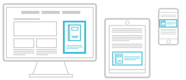

Form technology
Optimizing revenue streams is possible via world-class technologies including: predictive form completion, responsive design compatible with all devices – driving higher conversion rates and higher earnings per user.
Monetize Your Audience with RevResponse
Join for FreeRevResponse, The #1 B2B Publisher Network, has delivered professional content to Audiences across the globe and processed millions of leads for top advertising Vendors. Join us today.